table of contents
-
prelude
introduction
-
highlights
hand-picked work
-
information
quench your curiosity about me
-
work archive
more to satisfy your tastebuds
-
hire me
the hows and whys
view work by tag
animals, annual report, blog, brochure, catalog, consumer, copy, corporate, css, dance, ecommerce, icon, identity, integrated, integration, medical, personal, podcast cover, print, products, retail, screen, software, template, user interface, wallpaper, web, webapps, wordpress, zencart
why hire me?
I do not just make things pretty, I like to make things work.... more
f.a.q
answers to frequently asked questions... more
winnielim
integrated visual designer
a diverse, extended selection of work
archived work
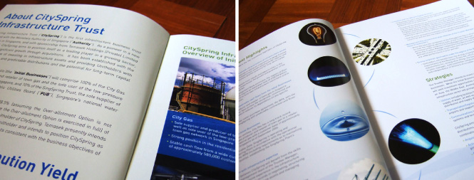
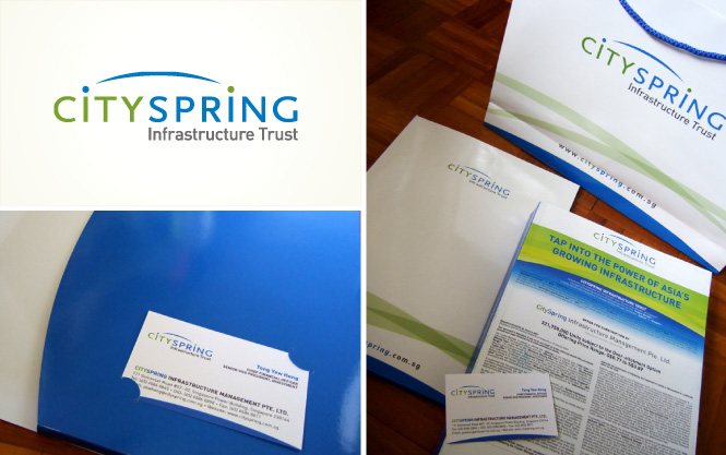
CitySpring Infrastructure Trust
completed Jan 2007
Integrated design for CitySpring Infrastructure Trust. CitySpring is an infrastructure investment trust sponsored by Temasek Holdings, it is also the first of it’s kind in Singapore.
This project was was an invited closed-door pitch while working under Equal Brand Design, and was won after an intensive selection process.
I was the sole designer in charge of conceptualization, design and production, as well as writing the following creative rationale for the pitch submission.
Creative Rationale for logo
The naming of CitySpring is derived from the two initial assets of the trust, CityGas and SingSpring. The concept behind the logo takes it’s cue from the naming, with the arc emerging from the two “I”s, with “I” representing the word “infrastructure”. The arc forms a linkage between “City” & “Spring”, embodying the combination of the two infra-structural assets to establish the founding of the Trust.
The linkage of the arc also forms a metaphorical representation of the close connection and relationship between the infrastructures, giving further emphasis on the principle that the basis of any infrastructure in a society or organisation is that all basic structures must be interlinked and interconnected to make the macro-organisation work.
The dots on the “I“s have a swop of colours, subtly signifying that an inter-exchange has taken place through the arc, demonstrating the movement of information, commodities or people through infrastructures.
The blue arc additionally symbolises a horizon, representing far-sightedness and extensive coverage.
identity design and collaterals
brochure spread for initial public offering